
Album Cover Concept Designs
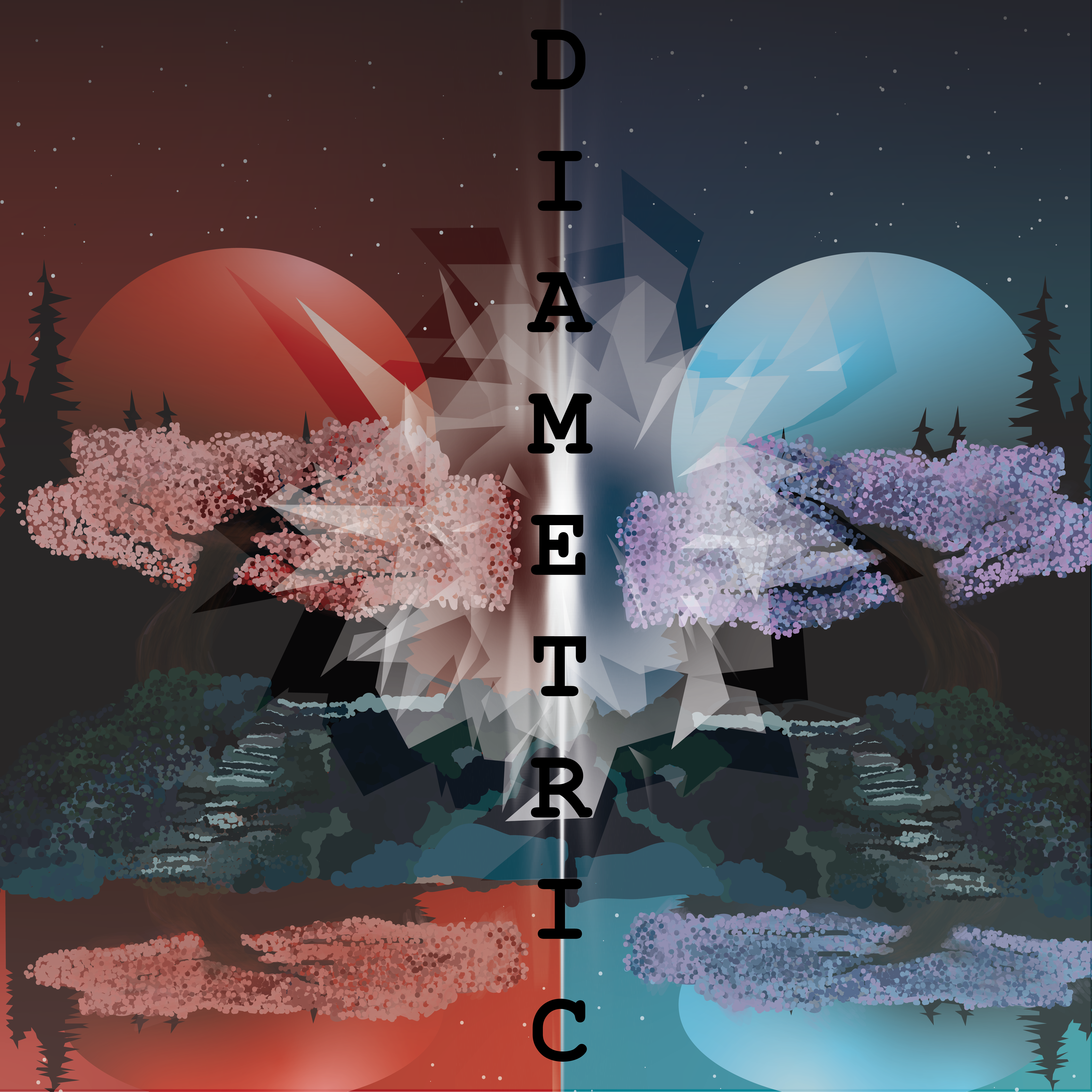
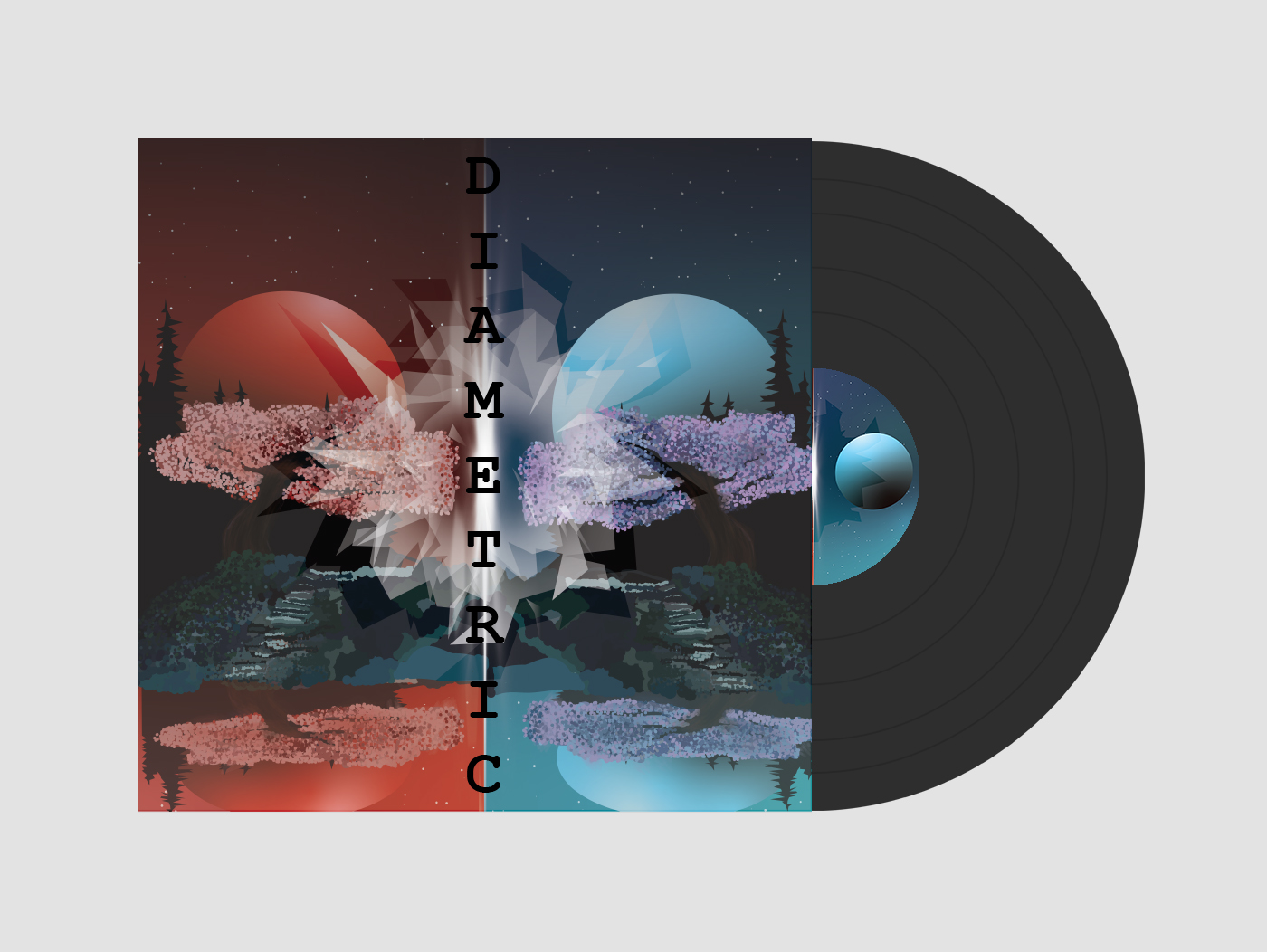
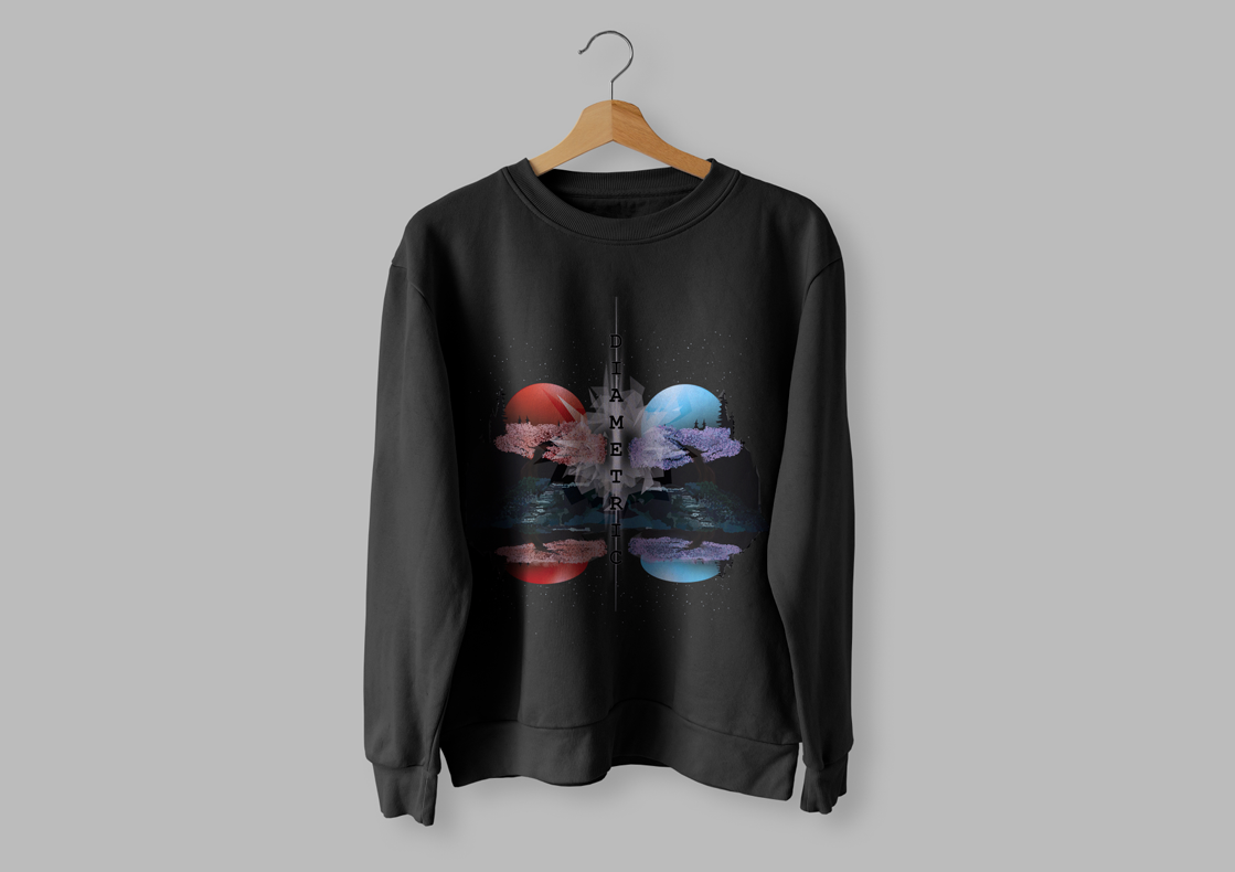
Diametric
I began by envisioning how I wanted the album to look. Using Illustrator, I sketched an island on the water with the moon in the background, which became the focal point of my design. This initial concept took the majority of my time, but as I neared completion, I was inspired to explore the themes of symmetry and opposites. I decided to duplicate the artwork and mirror it on the other side, while altering the primary color scheme. The resulting contrast created a dividing line in the center, sparking the idea of worlds colliding. This led me to incorporate a ray of light down the middle, symbolizing the clash of two realms.
To add more depth and meaning, I included broken glass shards in the foreground. These fragments represented the destruction of barriers and the merging of opposing forces. The name Diametric perfectly captured the essence of the piece, as the two sides of the album art embody complete opposites, with one side showcasing warm tones and the other cool tones.
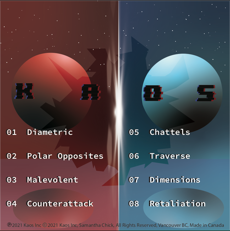
Originally, I planned to invent a completely new artist name, but I ultimately chose to use my primary personal IGN, Kaos. Pronounced like “chaos,” Kaos is a blend of “karma” and “chaos,” combining the “k” from karma, the shared “a,” and the “os” from chaos. This name resonated deeply with the artwork’s theme, as diametric opposites often give rise to chaos. This connection felt natural and fitting for the project.
The album songs themselves are titles I crafted to reflect and tie into the overarching concept, with Diametric serving as the title track.
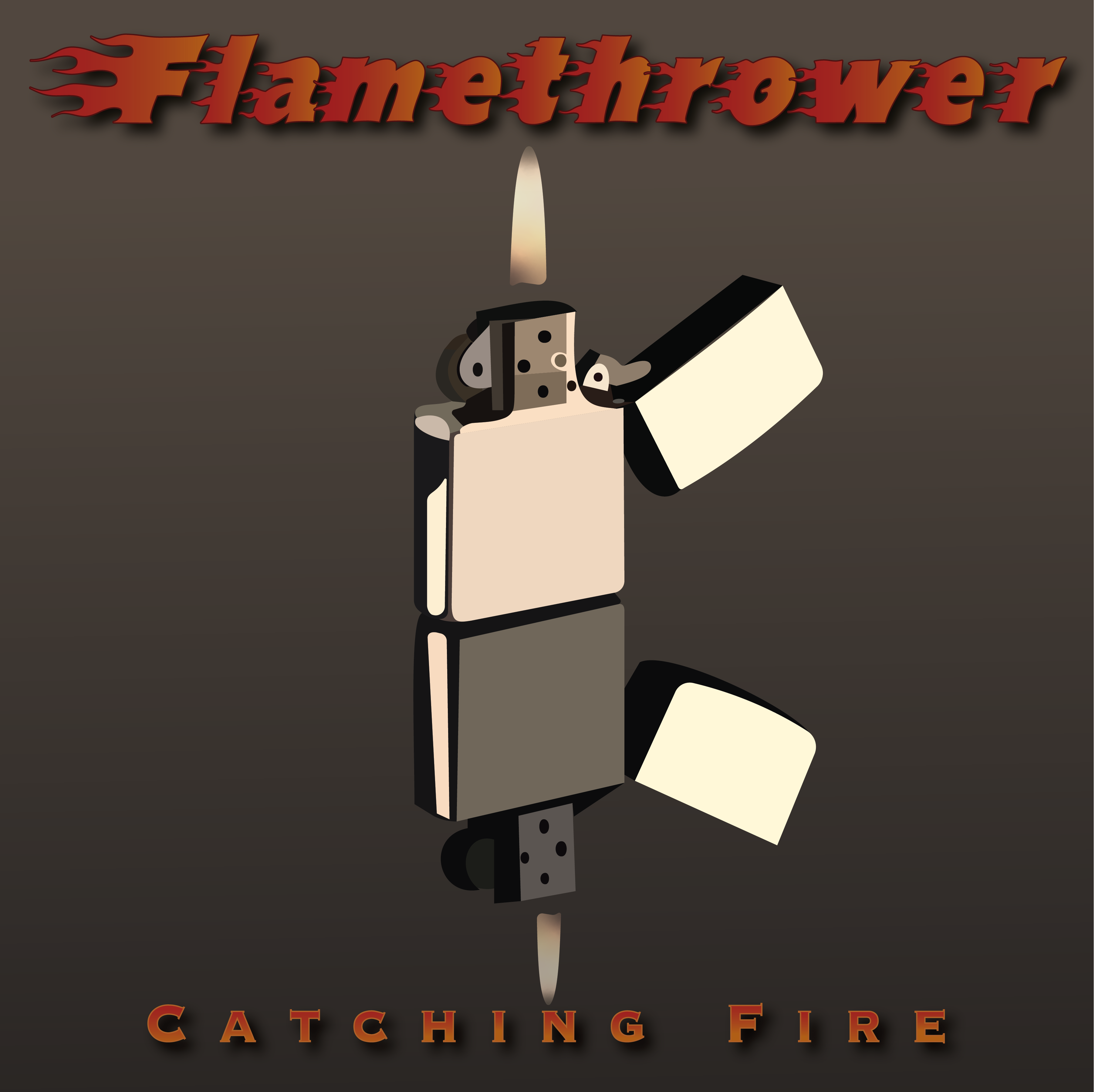
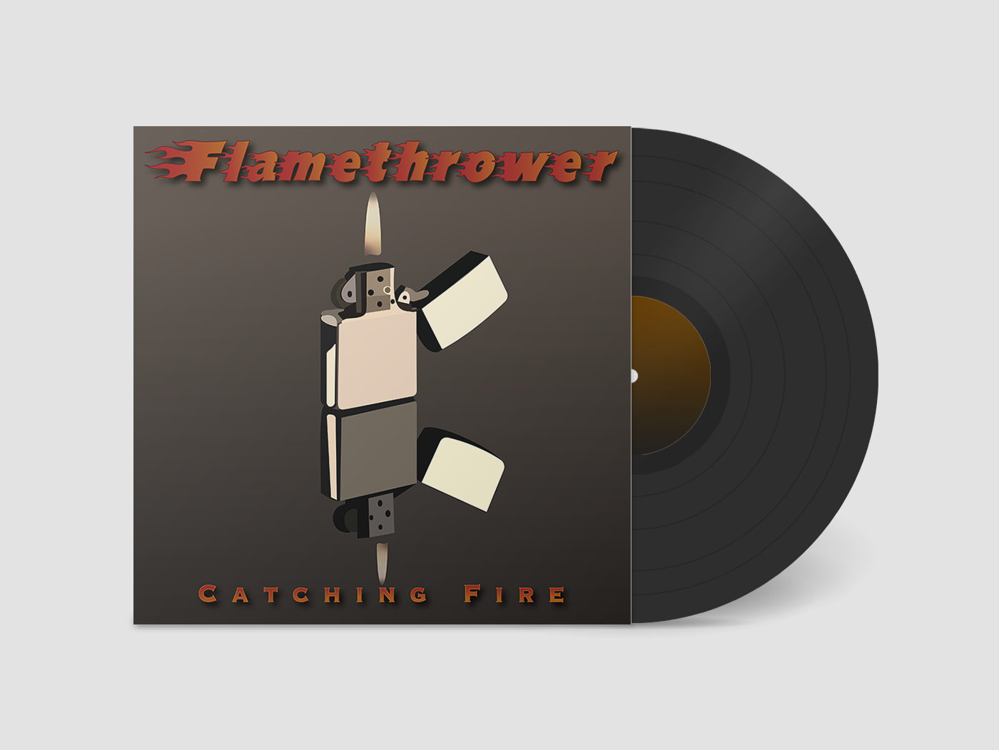
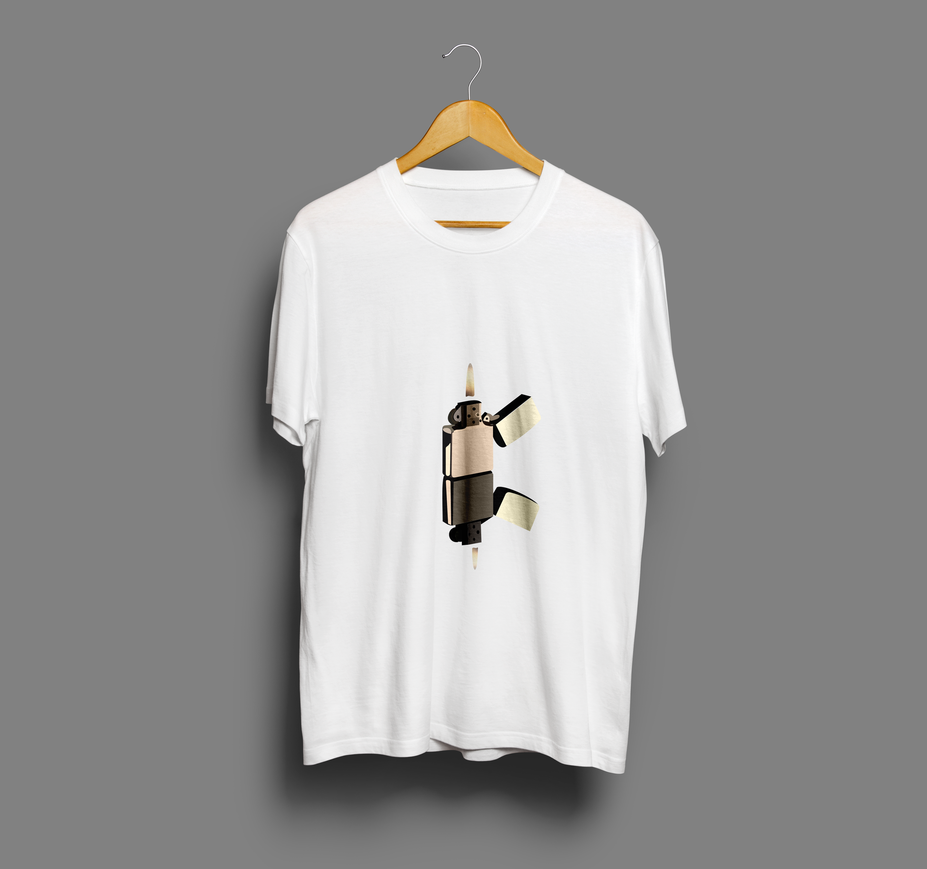
Flamethrower
The concept for Flamethrower emerged from the desire to create something bold and striking, yet minimalist. The centerpiece of the album art is a lit Zippo lighter, its flame flickering vividly against a dark background. Below it, the lighter’s reflection extends downward, mirroring its intensity and hinting at themes of duality and power. The interplay between the flame and its reflection became the focal point of the design, symbolizing both creation and destruction—a fire’s ability to illuminate and consume.
I wanted the simplicity of the lighter to carry a powerful message. The reflection at the bottom not only added depth to the composition but also reinforced the idea of introspection, as if the flame is confronting its own existence. The dark, moody tones surrounding the lighter allow the flame to stand out, creating a sense of raw energy and isolation.
The name Flamethrower reflects the album’s themes of intensity, passion, and unrelenting force. It encapsulates the spirit of the music—a collection of tracks that ignite emotions, spark ideas, and leave an indelible impression. The artist name, Catching Fire, aligns seamlessly with the album’s identity. It suggests both the act of igniting something new and the danger that comes with playing close to the flames.
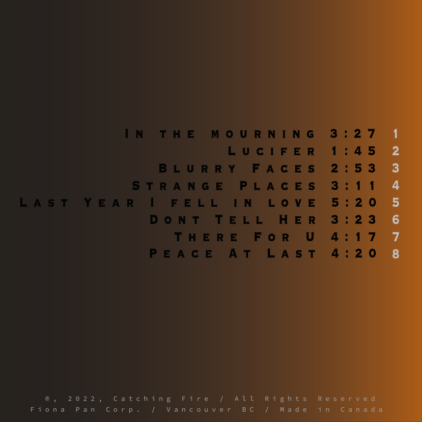
Each track name was carefully chosen to evoke the different facets of fire, from its warmth and guidance to its destructive and unpredictable nature. Together, Flamethrower and Catching Fire tell a story of power, transformation, and the fine line between control and chaos.
")
Asphalt
The inspiration for Asphalt came from the thrill and chaos of speed, power, and the allure of rebellion. The album art captures an Audi R8 in the midst of a dramatic drift, with smoke billowing from its tires and spilling out beyond the confines of a bold purple border. The border frames the scene, yet the car’s movement breaks free, symbolizing the raw energy and untamed spirit of the music.
The choice of purple as the primary accent color was intentional—it conveys a sense of luxury and intensity, balancing the aggressive movement of the car with a sleek and stylish edge. The drifting Audi R8, a high-performance car known for its speed and precision, serves as a visual metaphor for the album’s themes: pushing boundaries, living in the moment, and embracing the chaos that comes with chasing adrenaline.
The album’s name, Asphalt, directly reflects the gritty and urban undertones of the art and music. It’s a nod to the roads we travel—both literally and metaphorically—and the marks we leave behind, much like the tire smoke curling across the artwork. The drifting car breaking past the border embodies the refusal to be confined, a sentiment echoed in the album’s tracks.
App Branding Design


I designed PhotoMotion, as a concept for an app that transforms photos into videos using generative AI. By combining photo and video editing into one platform, PhotoMotion allows users to animate illustrations or photos, creating fluid, animation-style videos. The app enables users to tell stories or convey messages effortlessly by adding realistic motion and transitions to static images.
Through my research, I identified that users prioritize editing software with an intuitive interface, high-quality import/export options, and innovative features like AI. Inspired by successful software like Adobe, which integrates cutting-edge technology, PhotoMotion is designed to meet these expectations.
The visual design of the app uses an analogous color scheme of electric blues and purples, blending vibrant and professional tones to reflect creativity and technology. Gradients and neon elements enhance the futuristic, high-tech aesthetic, aligning with the generative AI aspect. Clean, modern sans-serif typography with rounded edges ensures a professional yet approachable feel. Imagery showcasing the seamless transition from static photos to dynamic videos reinforces the app’s functionality and purpose.

Serendipity Skin Care


Video Game Concept Design

White Balance is a multiplayer role-playing puzzle game that challenges players to collaborate silently, utilizing their unique characters’ skills to navigate intricate predicaments. The narrative follows a blend of the hero’s journey, Ganga comics, and Epiphanic structure, immersing players in a transformative storytelling experience.
Players enter the world as glowing red, blue, or green silhouettes, each representing a distinct mindset and problem-solving style:
Red: Physical, action-oriented solutions.
Blue: Logical, analytical problem-solving.
Green: Emotional, empathy-driven approaches.
Once the game begins, the players never make direct contact with each other and are forbidden to speak to each other outside of each puzzle’s notebooks. They begin by making their way through different life problems and learn how to find solutions using the perspectives they’re given. Each colour will have its unique mindset and perspective, resulting in its own way of solving problems. Red will be able to solve problems through more physical solutions, Blue through more logical solutions, and Green through more emotional solutions. The players, along with their characters in the game, will have to learn how to communicate effectively and adapt to each other’s playing styles and methods.
Wrapping Papers


Business Cards


Wrapper Design
